/ Well Naturally
- /Brand Strategy
- /Brand Identity
- /Packaging Design
- /Website
- /Social Content
- /Communications
From the pharmacy to the masses.
Well Naturally was the category leader, but niche appeal was holding it back. It needed to be set free in order to grow.
Well Naturally’s story is that of a pioneer who became the No.1 no added sugar chocolate brand, but in a growing category with ever increasing competition, new brand owners knew that what got them here was not going to get them there, and it was time for a refresh.
Our strategy was simple. Leave behind the things that were not working, and take advantage of unrealised creative opportunities (like an amazing brand name) to build stronger brand assets that would resonate more strongly with a far wider audience.

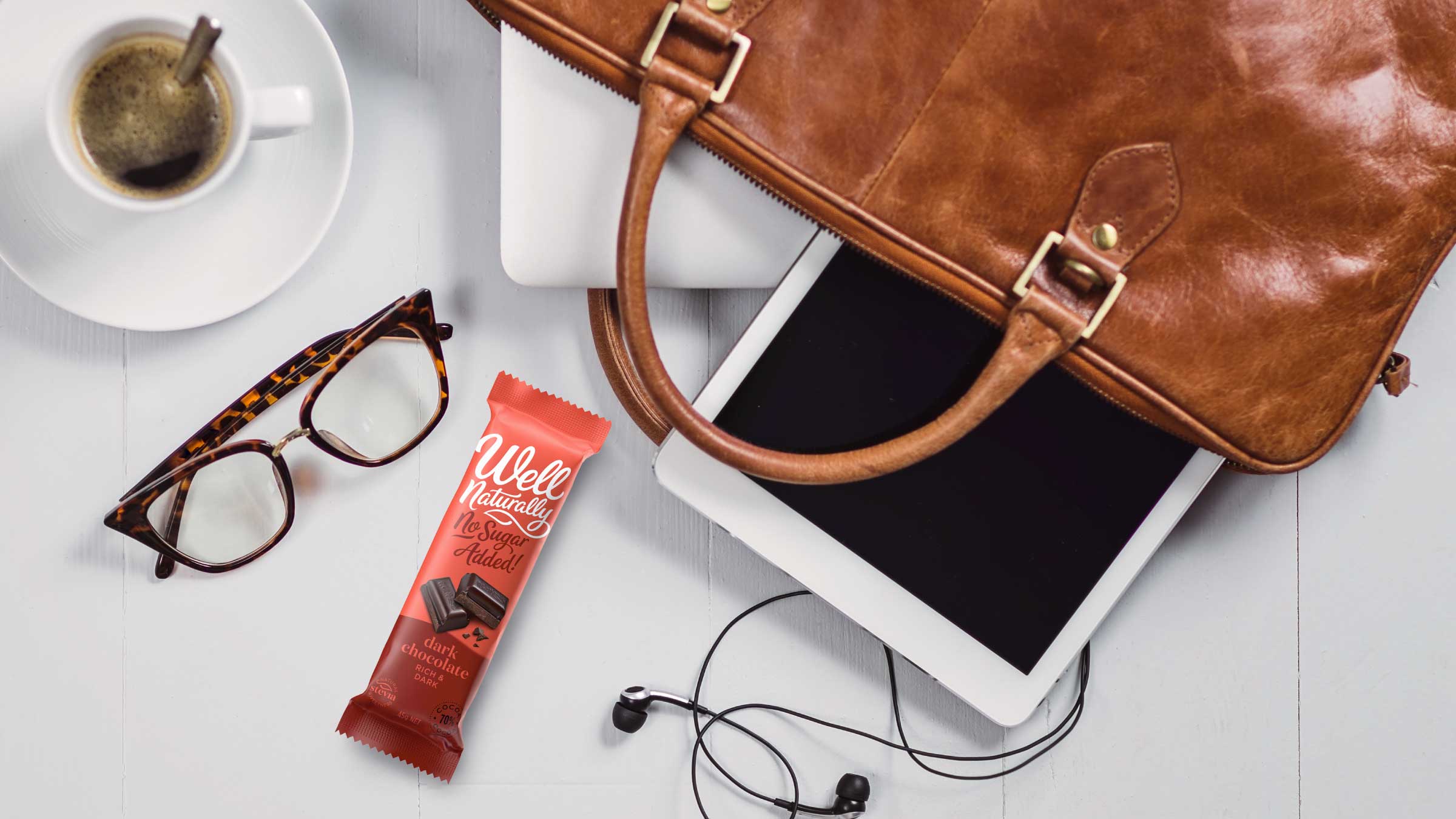
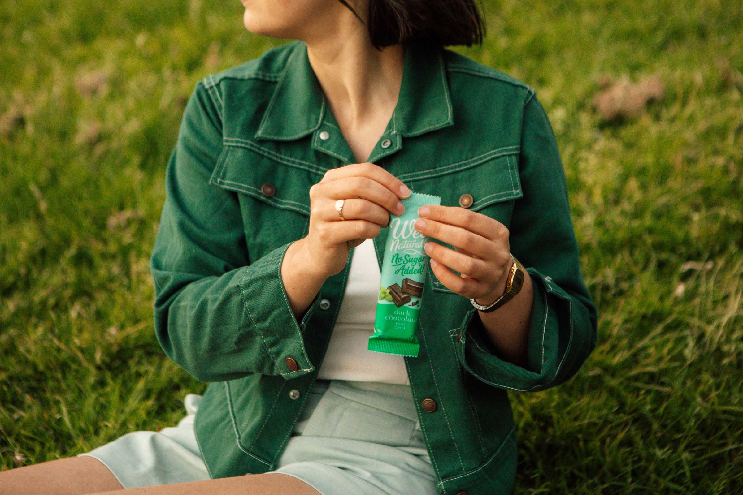
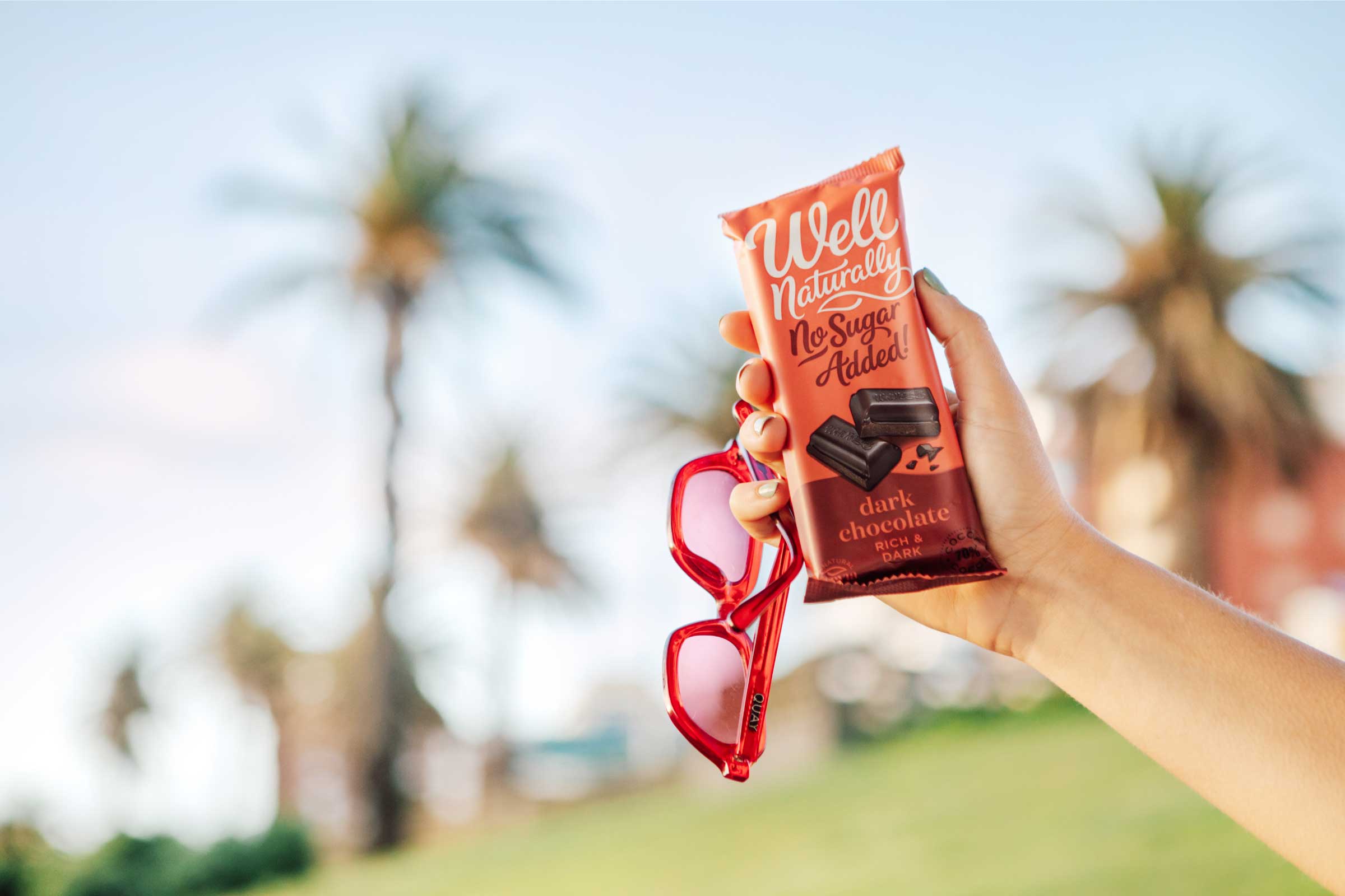
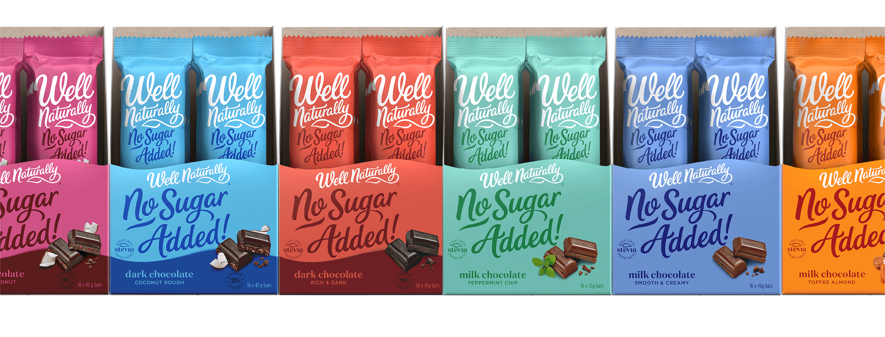
It was time to ditch the ‘pharmacy chocolate’ look and lead with consumer benefit – enjoyment and freedom – shifting the emphasis from product to brand, creating something truly distinctive and ownable. Free spirited typography. A lively, but mature colour palette. Mouth-watering product photography. The result was packaging which loyalists were craving – something they could be proud to be seen eating – as well as a platform for brand growth.


/ “Thanks to Disegno, we’ve created opportunities with retailers that simply didn’t exist before.
”
