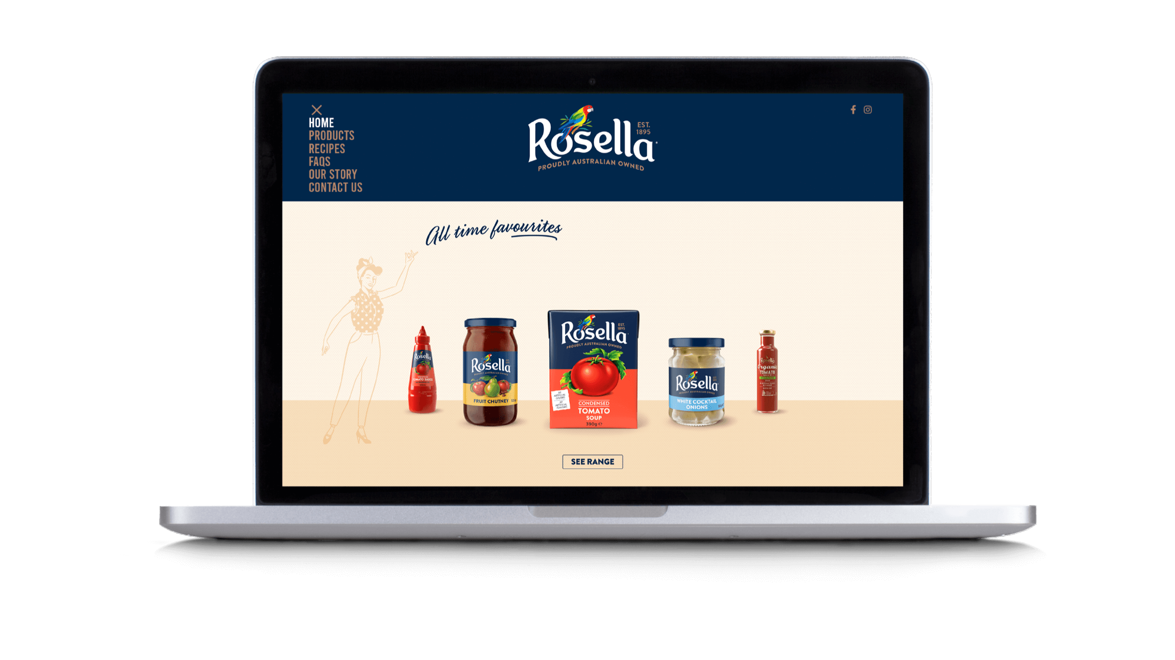
/ Rosella
- /Brand Strategy
- /Brand Identity
- /Packaging Design
- /Website
Rebooting Australia’s flavour icon.
Rosella didn’t need a brand refresh, it needed reviving, and making what’s old, new again was at the heart of rebooting this neglected Aussie icon.

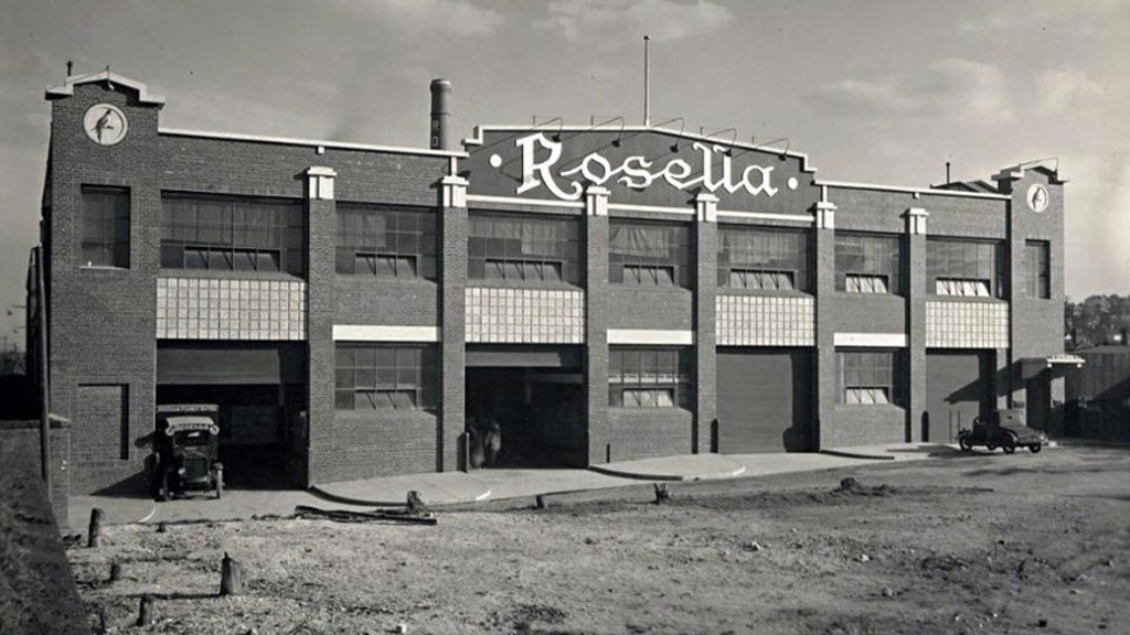
Aussie brands don’t get much more iconic than Rosella. At its peak it had 1,000 employees, six factories and over 100 products. But after decades of neglect and failed comebacks, in 2021, with just 11 products left on supermarket shelves, Rosella’s iconic Condensed Tomato Soup was delisted. The brand had reached its lowest point in over 125 years. It needed to be revived.
Soup, sauce, chutney, pickled onions. Rosella was operating in mature, commoditised categories against much, much bigger brands. The average age of its consumer-base was at retirement level, and it was only in a fraction of Australian households. It was clear the revival needed to be brand and innovation led. We had to celebrate the past while being firmly focused on the future.
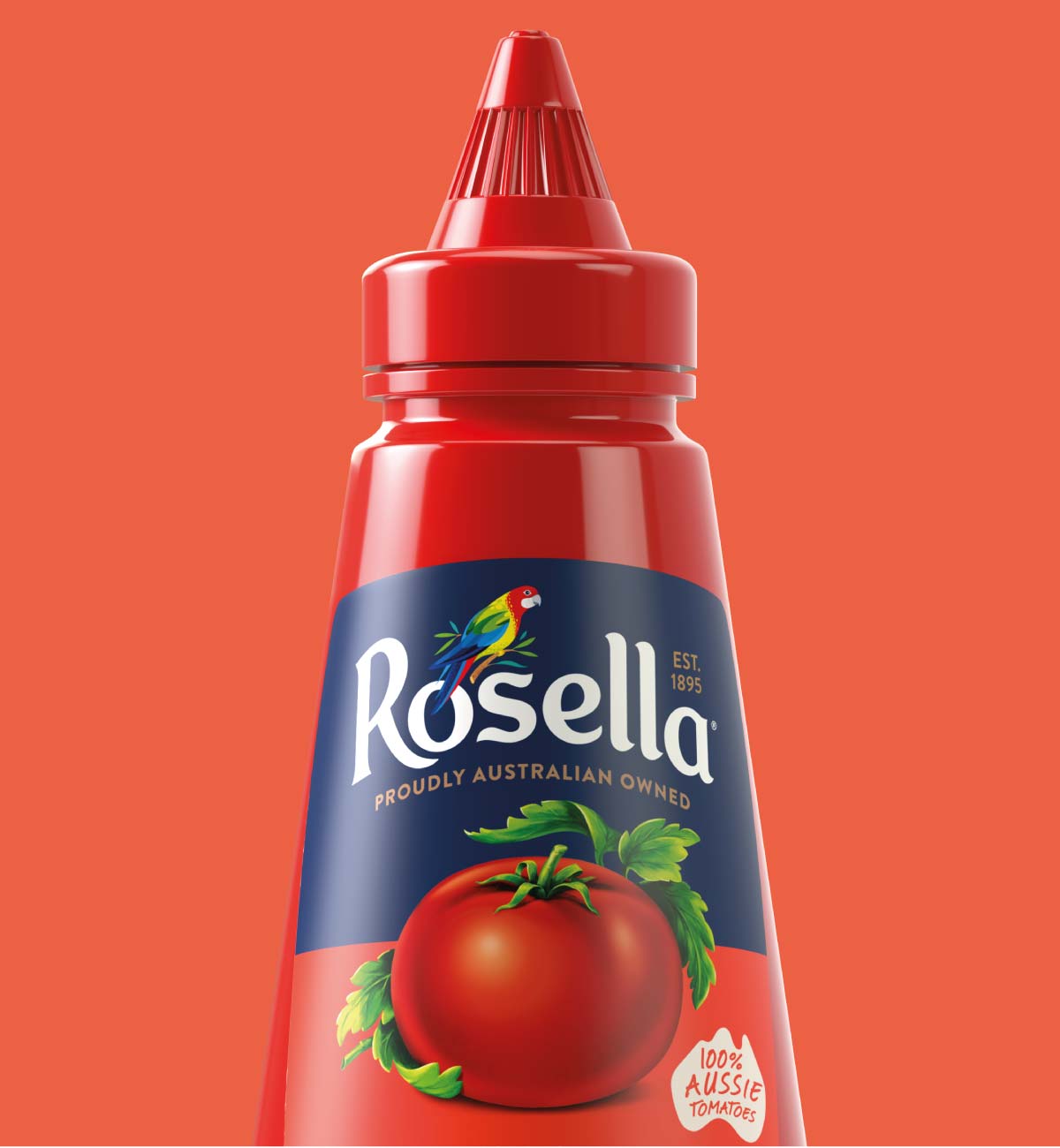
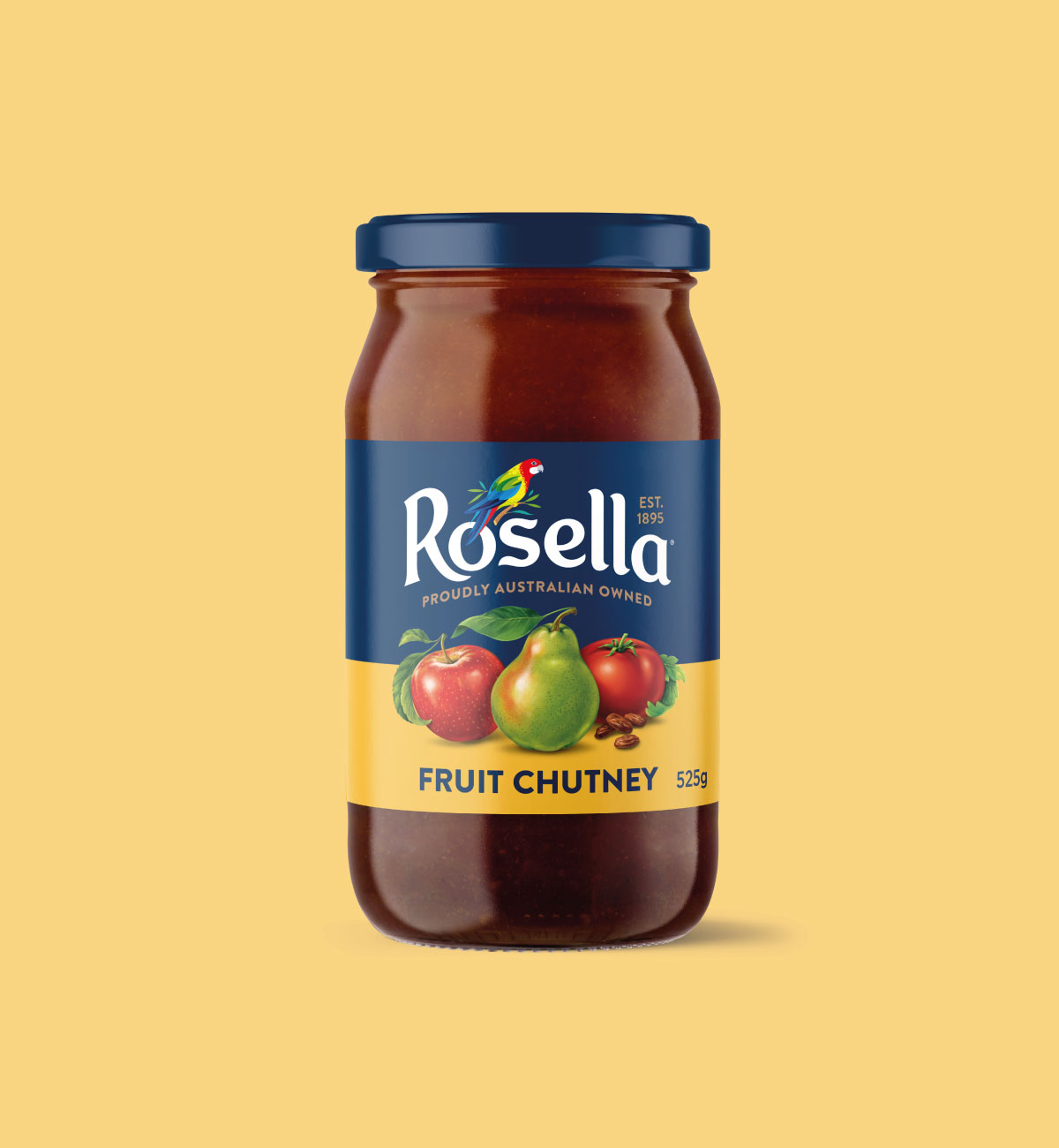
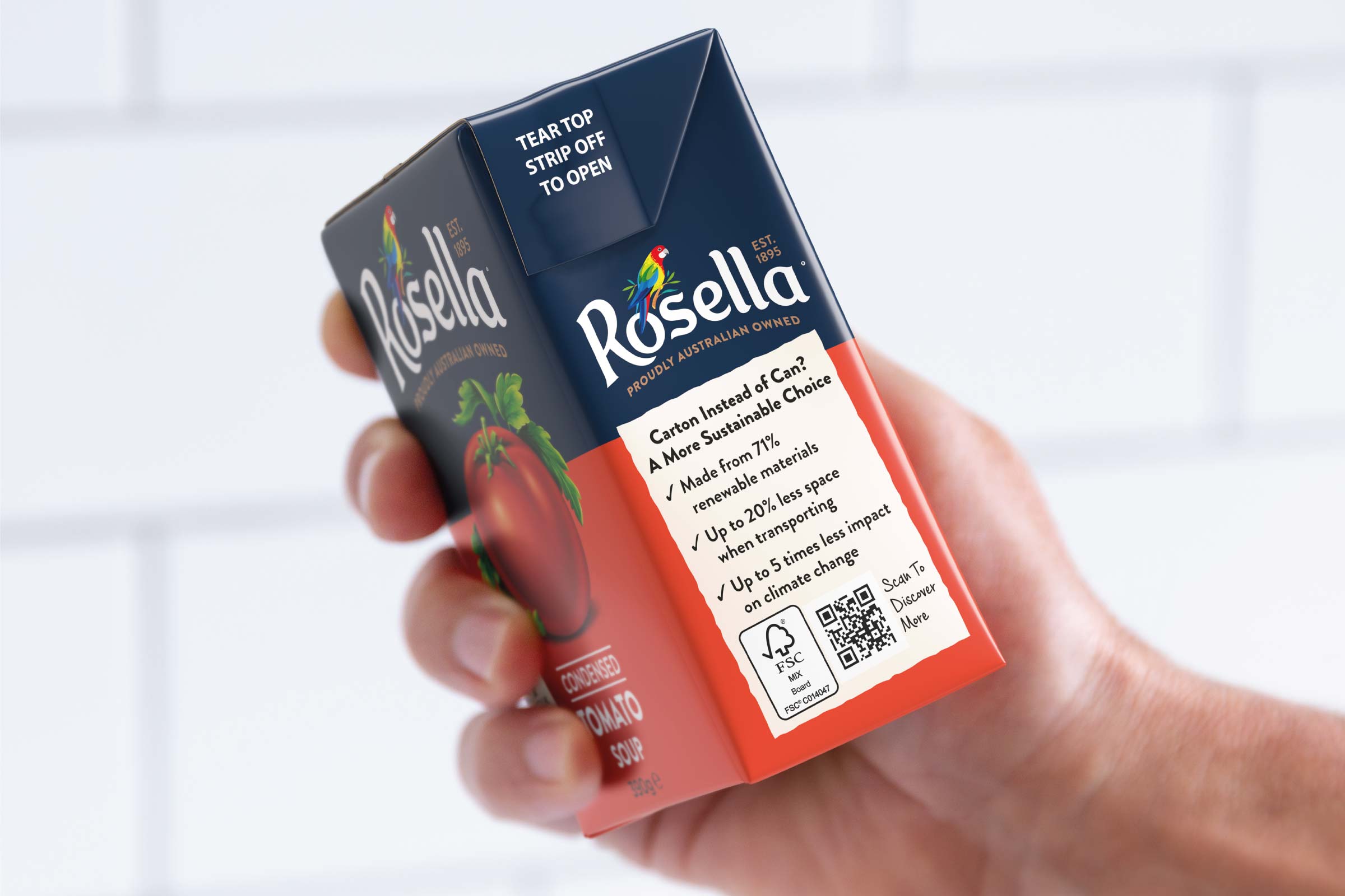
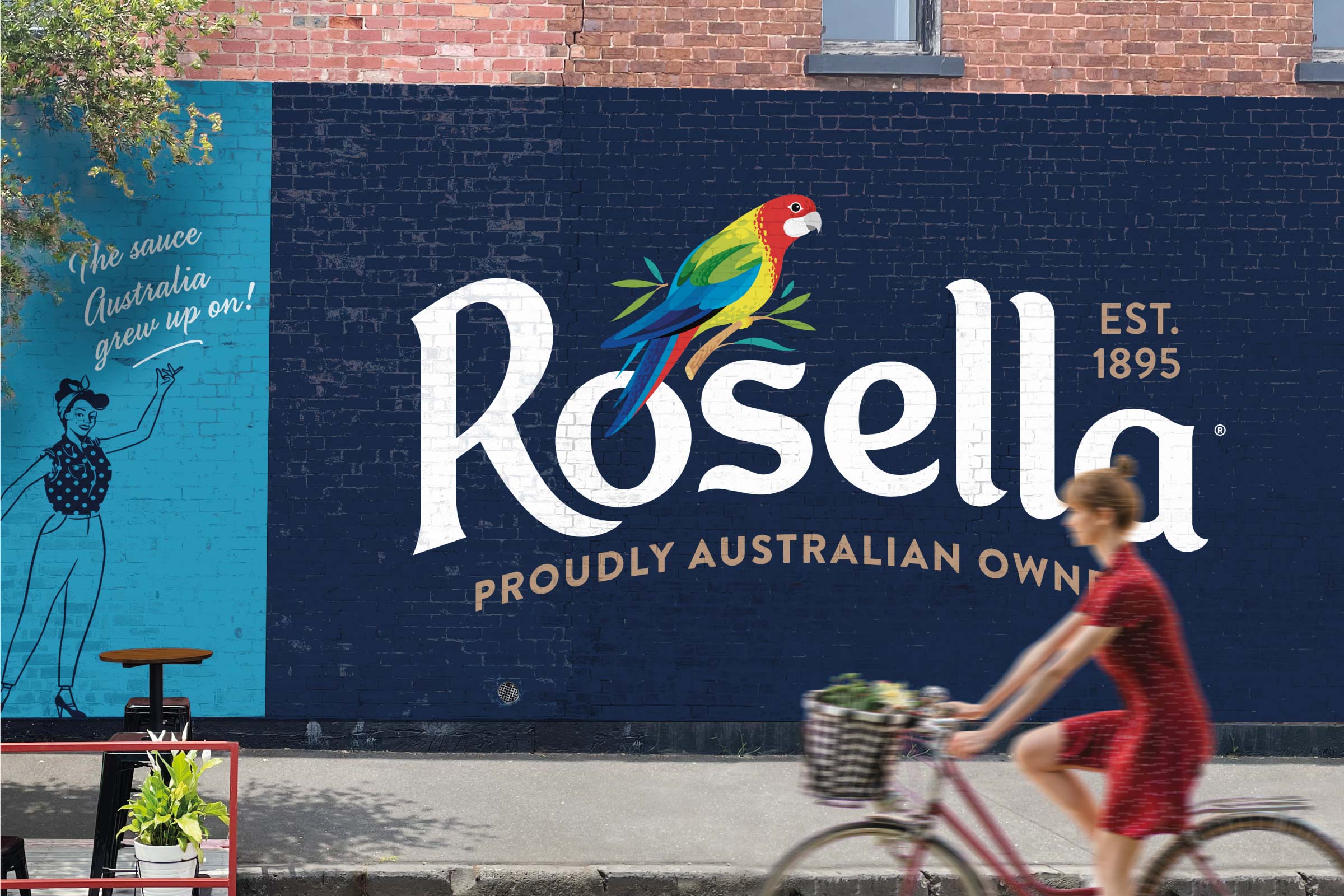
Tapping into Newstalgia would make what’s old, new again. We dug deep into Rosella’s historic library and were inspired by a rich visual tradition. Our split design is bold and provides a platform for future NPD. New life was injected into the old bird illustration and logotype, while ingredient illustrations take centre stage. Making a comeback in TetraPak rather than cans for soup was also a giant leap forward in sustainability.
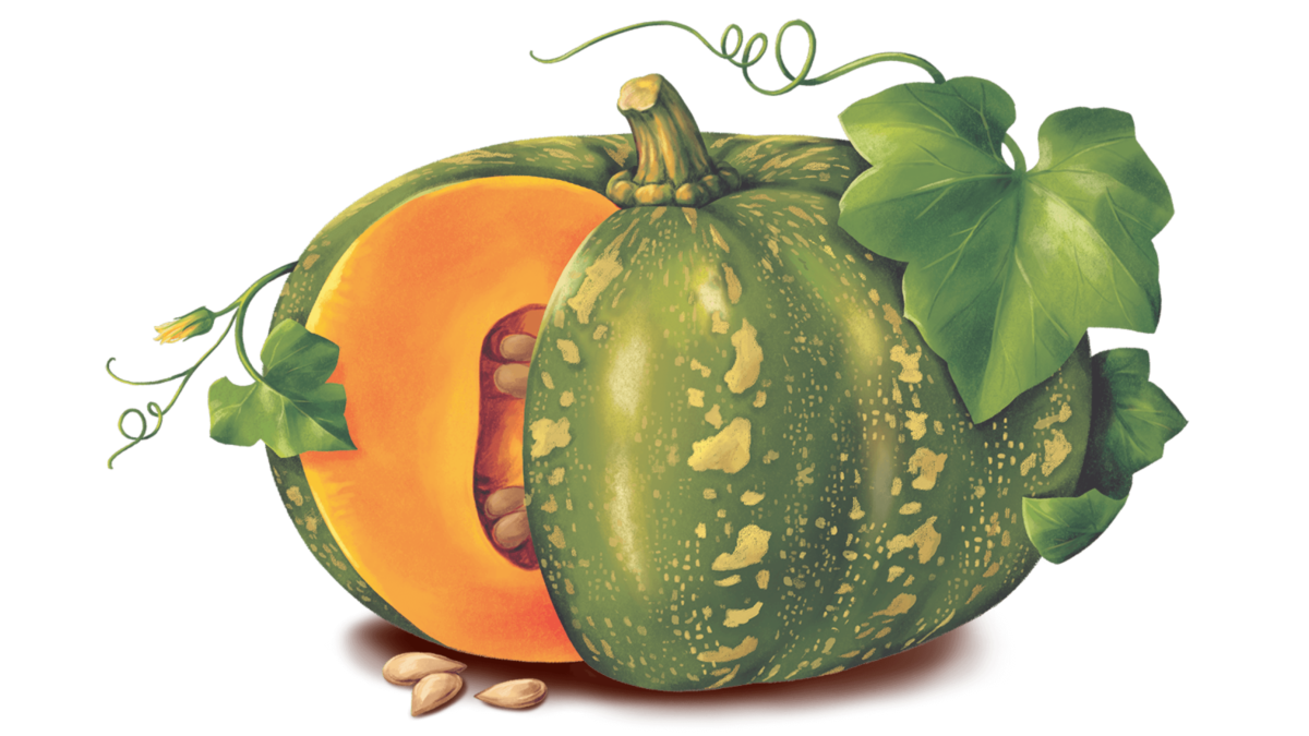
Illustration: Jum Mapon
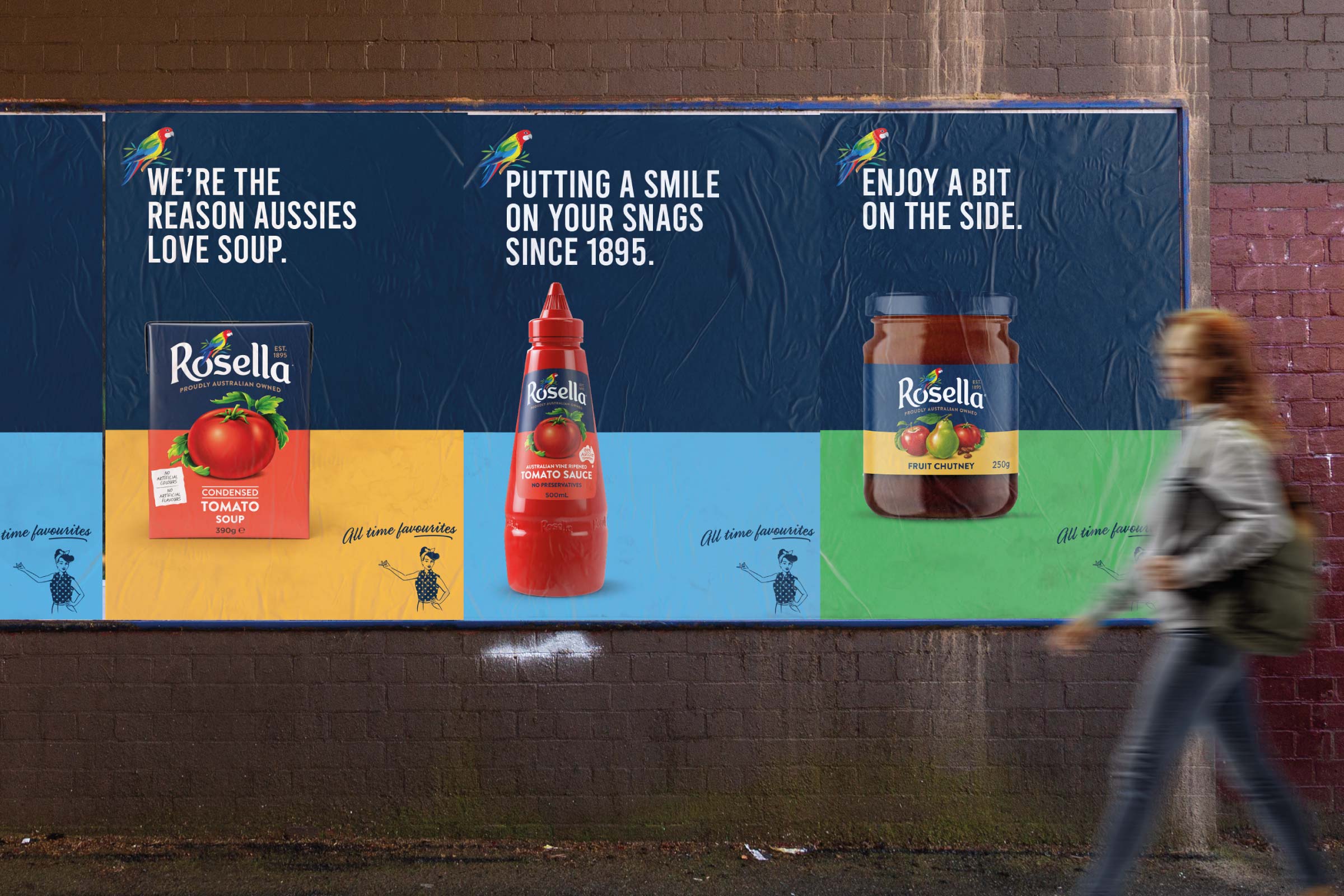
/ “Disegno nailed it. Our current consumers are excited about our soup being back on shelves again, we’re achieving a higher price point and retailers are engaged about future innovation plans. The future is looking bright for Rosella.
”
