/ King Island Distillery Martha’s Moonshine
- /Brand Strategy
- /Brand Identity
- /Packaging Design
Not all who wander in the night are lost.
Martha’s Moonshine is the outlaw of the range – inspired by tales of shipwrecked smugglers and renegade distillers along King Island’s wild northeast coast. It’s not refined. It’s raw. And it wears that with pride.
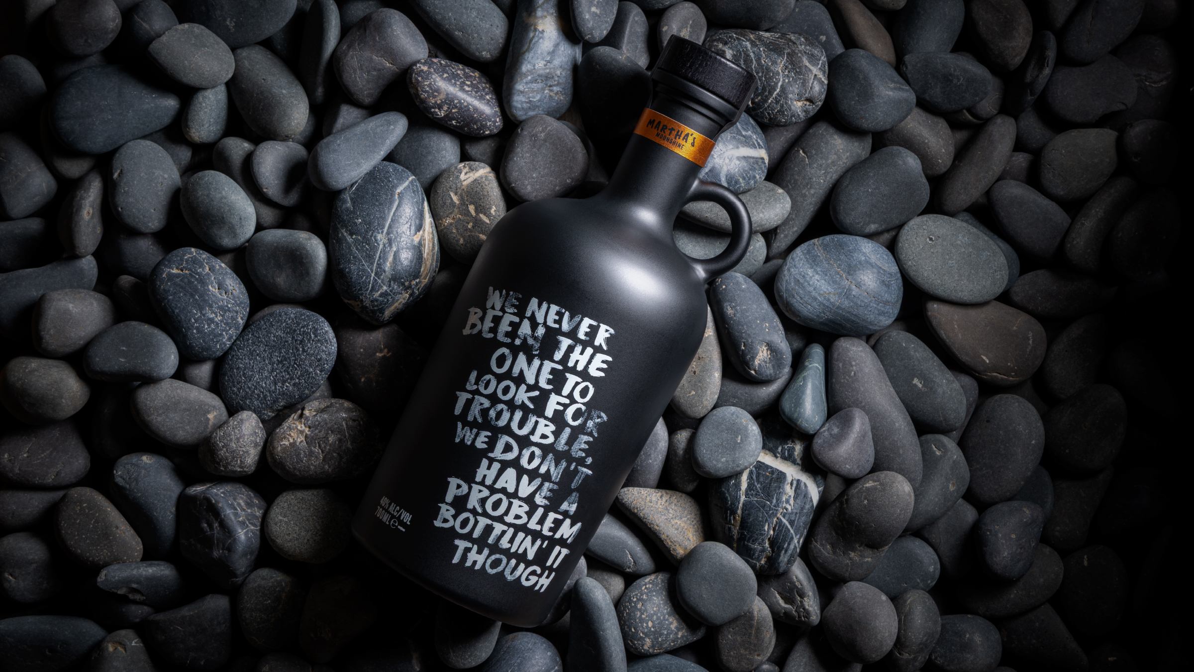
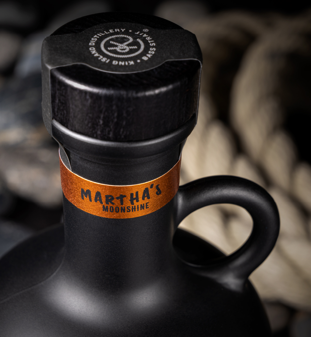
The design throws category codes overboard. Matte black. Oversized shoulders. A heavy glass handle like a contraband canteen. No front label – just a neckband and a hand-scrawled creed across the glass. It looks and feels like it was never meant to be found on a shelf – only smuggled, swigged, and shared.
Every element of Martha’s breaks the rules by design. It doesn’t chase polish. It wears defiance. A product of place, grit, and the spirits who never played by the book.
Awards
Transform ANZ 2025
Silver – Best use of packaging
Silver – Best strategic or creative development of a new brand
Melbourne Royal Australian International Spirits Awards 2025
Silver – Design
/ “It’s not just branding – it’s storytelling in glass.
”