/ DON
- /Brand Strategy
- /Packaging Design
Making ‘Is Good’, better.
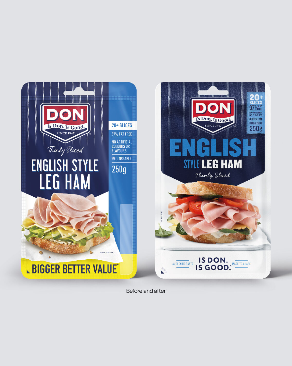
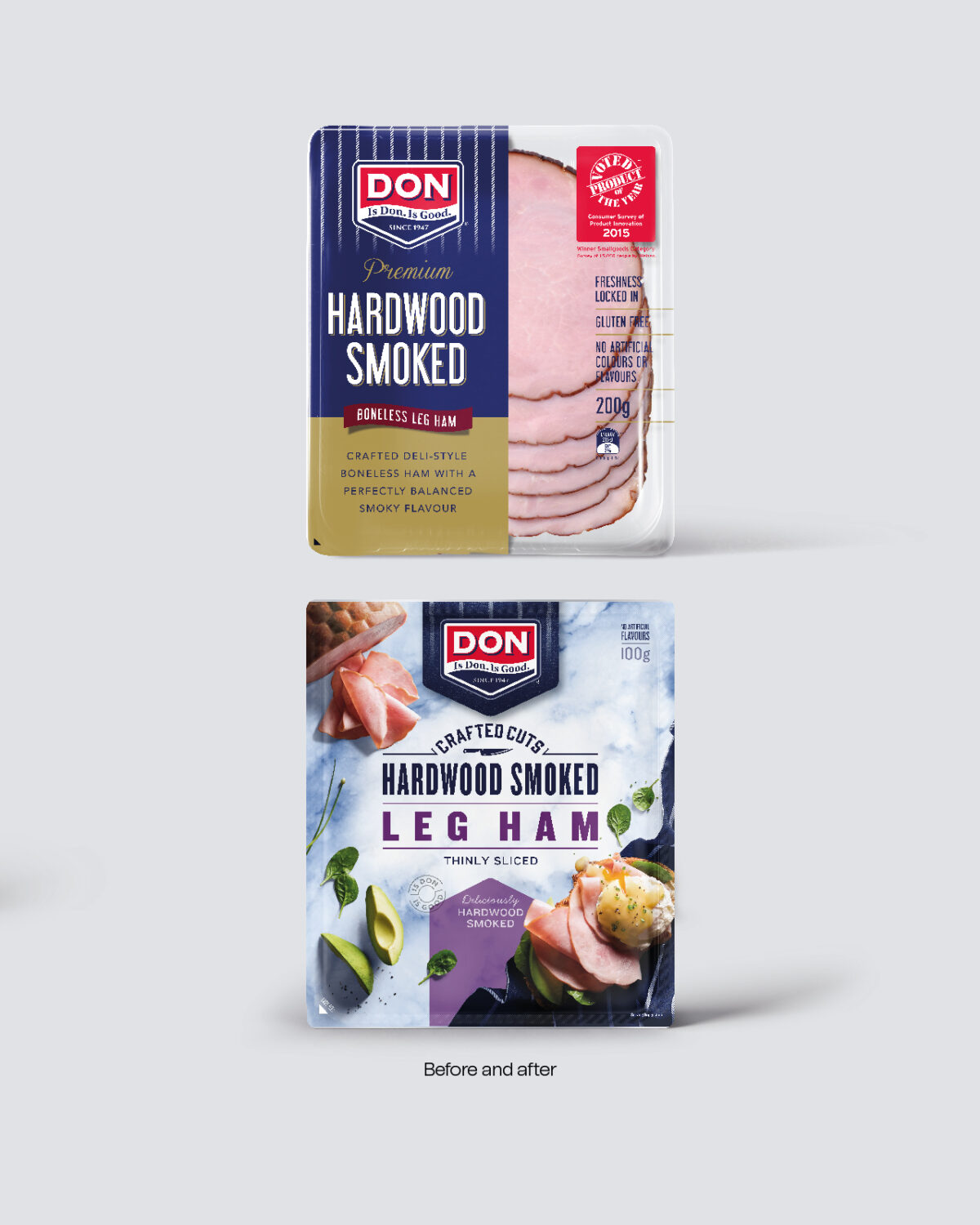
DON is famous for ‘Good’, but with an enormous category growth opportunity ahead they needed a better brand architecture and packaging.
Just about everybody has heard ‘Is DON. Is GOOD, but DON’s greatest asset was verbal, and awareness was still driven by the ‘90s TVC which had become culturally disconnected from modern Australia.
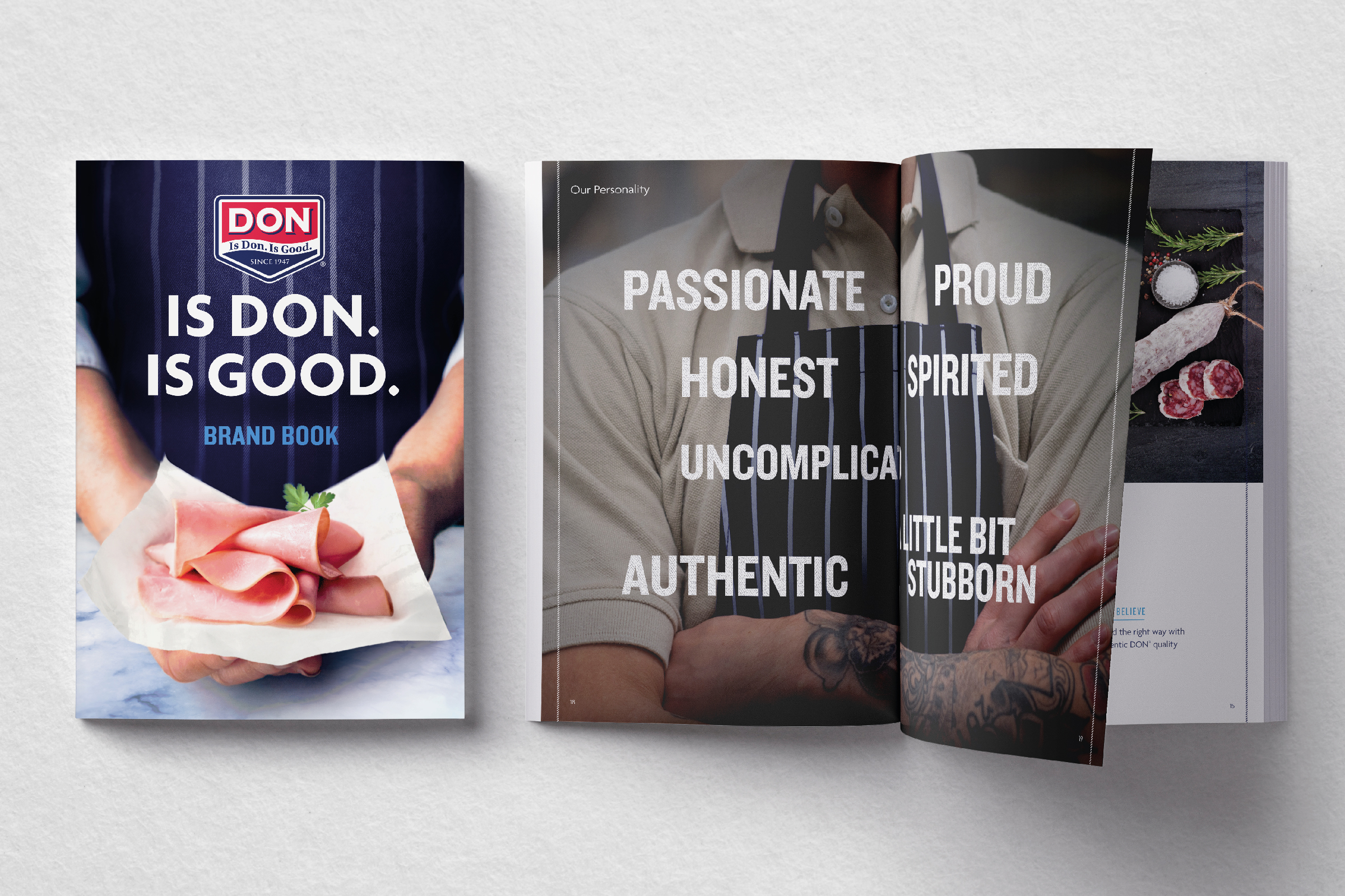
We looked back to go forward and identified two compelling truths that would guide the brand strategy going forward. Humble beginnings as an Essendon butcher who embraced the local immigrant community; and a healthily stubborn attitude to quality and craftsmanship that delivers the authentic taste which DON is famous for.
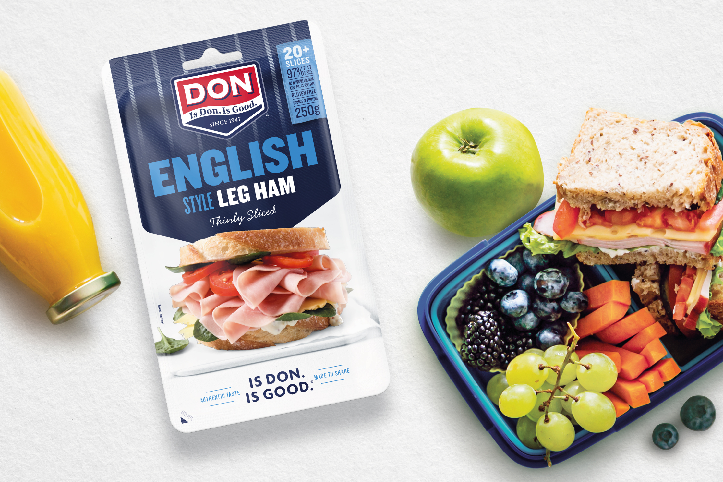
Our challenge was then to evolve, modernise and optimise. We started with the simplification of an overly-complex and confusing brand architecture by focussing on occasion to strategically access category growth. We designed and rolled out packaging across four ranges, all while developing distinctive visual assets; delivering maximum consumer purchase intent; maximising shelf standout and aiding shopability.
